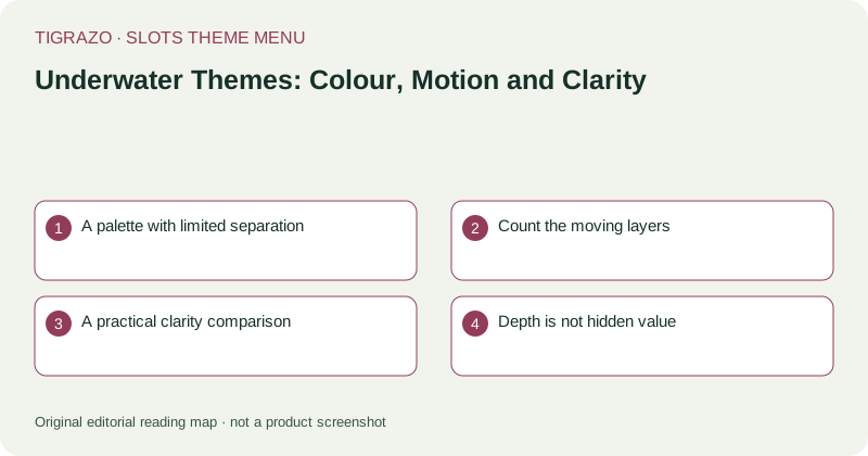
A palette with limited separation
Blue and green can create a convincing sense of depth, but repeating them across backgrounds, symbols and control panels reduces visual separation. Look at whether ordinary icons have distinct outlines and whether important text sits on a sufficiently plain surface.
Brightness alone is not enough. A glowing jellyfish and a glowing shell may still be difficult to distinguish if their shapes overlap. A useful collection note describes how icons differ in outline, scale and internal detail rather than simply praising vivid colour.
Count the moving layers
Underwater scenes often animate several depths at once: distant fish, a middle layer of bubbles and foreground symbols. These layers can make the reel area feel immersive while making it harder to locate a settled result or an information button.
Observe whether decorative movement continues across text panels. If available settings reduce animation, they may improve comfort, but their presence should be verified rather than assumed. Muting sound does not necessarily reduce visual motion, and browser settings do not change game rules.
A practical clarity comparison
Consider two hypothetical ocean screens. One places bright coral behind equally bright symbols. The other uses a subdued seabed behind clearly outlined icons. The second may be easier to read even if its artwork is less elaborate. That is a usability comparison, not a judgement about outcomes.
| Element | Useful question |
|---|---|
| Background | Can the reel boundary be identified immediately? |
| Symbols | Are similar sea creatures distinguishable by shape? |
| Text | Do stake and result labels remain readable? |
| Motion | Does decoration obscure a settled state? |
Use the same display size for both screens when making this comparison.
Depth is not hidden value
A treasure lying deep below the reels can suggest that something valuable is waiting to be uncovered. Unless the rules define a relevant mechanism, depth is simply scenery. A chest becoming brighter or a diver swimming closer is not independently meaningful evidence.
If a feature uses a collection display, read its trigger, scope and persistence explicitly. Do not extend a story about discovery into an assumption that continued play moves you toward a predictable return.
Curate for comfortable reading
Underwater themes can be grouped by tranquil illustration, realistic marine life or lively cartoon design. Within each group, note contrast and animation intensity separately. A calm soundtrack cannot compensate for illegible numbers, just as attractive colour cannot establish a symbol's role.
The most useful menu lets readers choose a visual atmosphere while keeping control clarity and written mechanics visible as independent considerations.