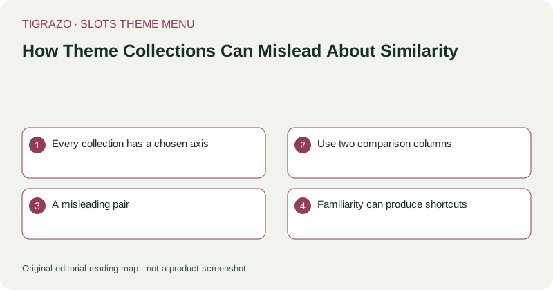
Every collection has a chosen axis
A jungle collection might group designs because they contain leaves, wildlife or expedition imagery. It says nothing by itself about combination rules, available controls or special-symbol behaviour. The curator has selected a visual axis, not certified overall equivalence.
Problems begin when a broad label quietly acquires technical meaning. Readers may start treating a theme family as if it guaranteed a familiar layout or similar variability. A clear menu explains its organising principle and avoids letting convenient navigation become an unsupported classification of game behaviour.
Use two comparison columns
Keep visual observations separate from rule observations. A feature can belong in one column without implying anything in the other. For example, two designs may both use ancient temples while evaluating combinations in different ways.
| Visual comparison | Mechanical comparison |
|---|---|
| Palette and setting | Defined combination structure |
| Symbol silhouettes | Symbol roles and exclusions |
| Animation intensity | Feature trigger conditions |
| Typography | Stake basis and payment units |
Neither column replaces the other. Readability matters, and so does knowing which rules the readable display is explaining.
A misleading pair
Imagine two hypothetical ocean designs showing shells and treasure chests. One uses a chest as an ordinary paying icon. The other assigns a chest a specific feature role. Describing both simply as treasure games would conceal the distinction a reader needs.
The correct response is not to avoid visual collections, but to describe their limits. Each game still needs its own symbol definitions and rule summary. Similar illustrations cannot carry those definitions across from one entry to another.
Familiarity can produce shortcuts
After learning one screen, a reader may stop opening information panels on lookalike screens. This saves effort while increasing the chance of importing an incorrect assumption. Familiarity should make the first navigation step easier, not eliminate verification.
The same caution applies to theme changes within a familiar-looking interface. A matching control strip does not prove that the selected stake, payment units or conditions are unchanged. Inspect the active labels rather than relying on memory of another design.
A better collection description
State what the grouping means in ordinary language: shared artwork, shared atmosphere or a recurring narrative motif. Then point the reader toward the dimensions that require individual inspection, without inventing a score that combines incomparable qualities.
A theme menu succeeds when it makes browsing clearer while preserving distinctions. It should never turn aesthetic similarity into a shortcut for predicting returns, assessing an unknown rule or deciding that one more spin is justified.