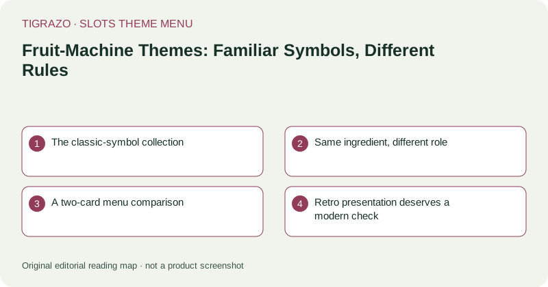
The classic-symbol collection
Cherries, lemons, bells and sevens form a compact visual menu. Their simple silhouettes can make a reel area easier to scan than an elaborate illustrated scene. That is a useful design quality, especially when several symbols appear together, but it says nothing about the likelihood or value of a result.
Even familiar fruit can be drawn in confusing ways. Two red symbols may look alike at small sizes, while a glossy highlight can obscure a number printed across a special symbol. Look at the full symbol key rather than identifying everything from a quick glance at the reels.
Same ingredient, different role
A cherry might be an ordinary paying symbol in one game and part of a separately defined feature in another. A bell is not automatically a scatter. A seven does not necessarily outrank every picture symbol. The paytable assigns those roles; cultural familiarity does not.
Pay attention to whether combinations follow marked lines, adjacent positions or another stated arrangement. The number of matching symbols is only part of the question. Their permitted positions and the selected stake basis may also matter when interpreting a displayed amount.
A two-card menu comparison
Imagine two hypothetical information cards decorated with the same fruit. Card A explains left-to-right line combinations. Card B explains a different collection rule. A screen containing three cherries could therefore have different significance on the two cards, even though the artwork seems interchangeable.
- Find the rule describing where a combination must begin.
- Check the required quantity of each ordinary symbol.
- Identify any symbol excluded from substitution.
- Read the unit used for each displayed payment.
This comparison is an information exercise, not a ranking of the two designs or a prediction about a future spin.
Retro presentation deserves a modern check
Older-looking lettering and mechanical reel effects can suggest simplicity. Yet the interface may still contain multiple stake controls, optional features or separate information panels. Open those panels before letting the nostalgic styling stand in for an explanation.
Listen critically as well. A bell sound may acknowledge an interface action rather than describe a particular financial result. Read the settled result and balance record instead of translating familiar noises into assumptions.
What belongs on the theme label
A useful fruit-theme description discusses visual contrast, symbol separation and the clarity of the rule panel. It does not call the theme generous, predictable or easy to beat. Choose it for the visual language if that language suits you, while keeping the mechanics in a separate column of your comparison.